Illustration
This is an area of design that is more vulnerable to me, as it relies on my personal style of drawing to fit the aesthetic of the piece. I am currently working to improve my skills in this area and I am learning new techniques and skills every day.
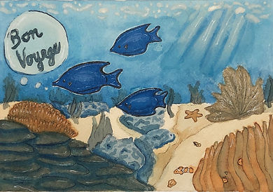
The Great Barrier Reef Postcard
This project tasked me with creating a postcard for The Great Barrier Reef using a complementary color system. I chose blue the for the ocean and the fish and used orange tints for other details. This reinforced my love for watercolors and inspired me to continue improving my skills.
A Snail's Point of View
This is one of my first times working with a comic format. I had to interpret a traditional haiku into a visual story while incorporating the original haiku. I also implemented a complementary color scheme for this piece, but I'd like to challenge myself to explore more color palettes in the future.

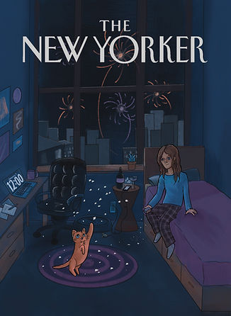
The New Yorker- Winter 2022
This project was very fun conceptually! The task was to create a mock cover for the New Yorker centered around the theme of winter. This time of year reminds me of celebrating the new year and new beginnings, but I wanted to explore that idea in a much smaller way. We always see the giant celebration happening in New York, but what about the quieter side?